Spotted: FOCUS/26 Trends
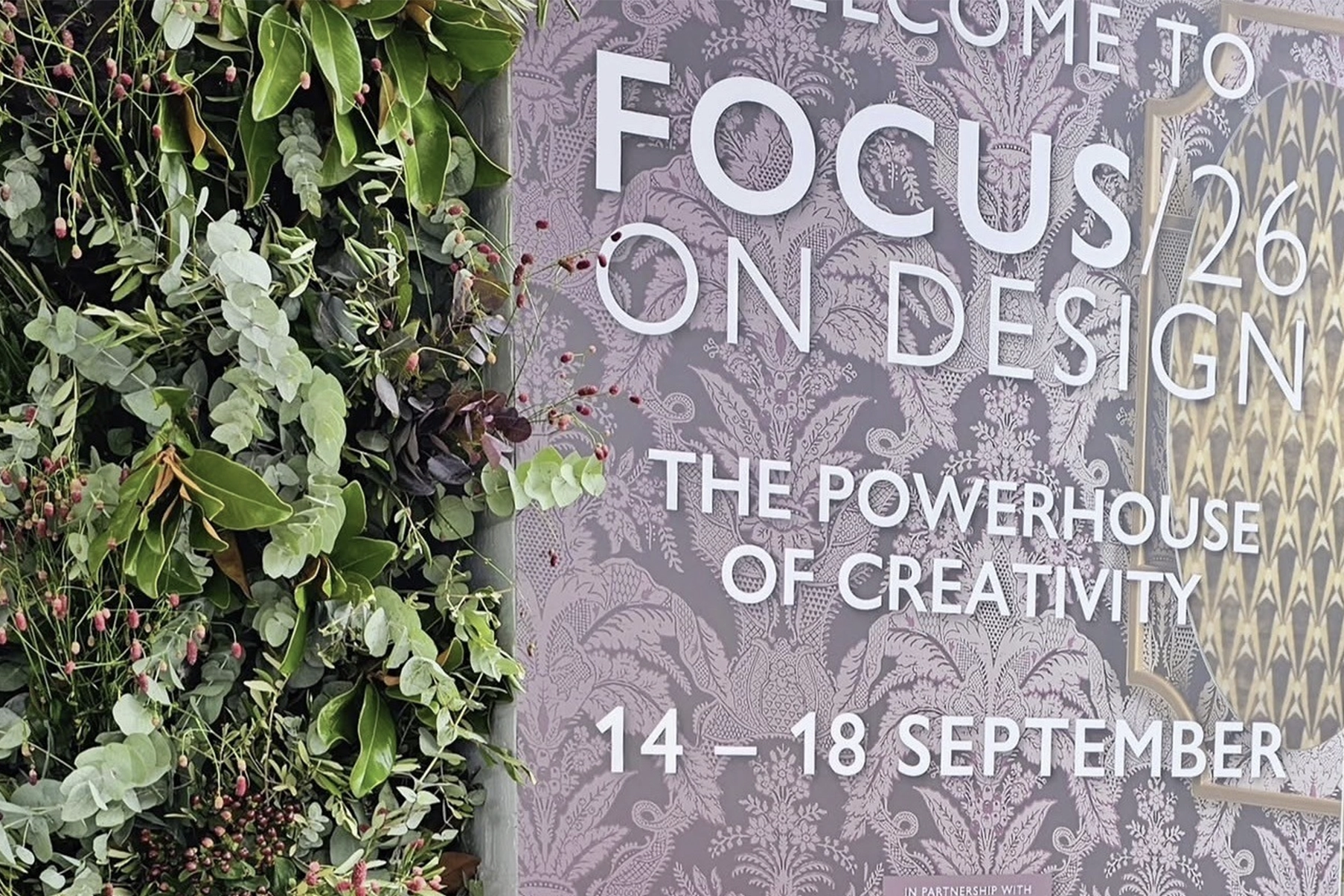
September once again brought one of the biggest moments in the design calendar to Design Centre, Chelsea Harbour, as FOCUS/26 returned to the landmark destination. Showrooms across the building unveiled their new collections, launches and pop-ups for the season ahead. Wandering the halls, four trends kept resurfacing, some bold, some soft, but all pointing to where interiors are heading next.
Here’s our round-up of the top trends we spotted this year.
Leopard Print
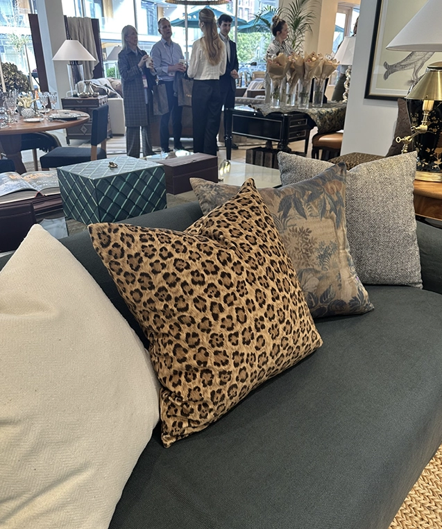
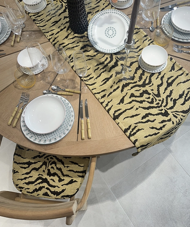
Animal print is back with confidence this season, and leopard led the pack. At Perennials Sutherland Studio, it turned up on table runners, dining chairs and even wallpaper – a proper commitment to the print, and proof it works just as well on a wall as it does on a seat cushion. It’s a print that instantly adds a sense of glamour and personality to a scheme without overwhelming it.
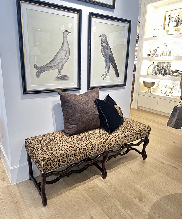
Ralph Lauren’s first view took things a step further, with the Os de Mouton Bench upholstered entirely in leopard print and finished with a set of matching cushions. Sat against the bench’s curved, sculptural frame, it read as polished rather than overly decorative. That’s really the story of leopard this season: it’s shedding its “statement accent” reputation and starting to behave more like a neutral.
Butter Yellow, Paired with Blue
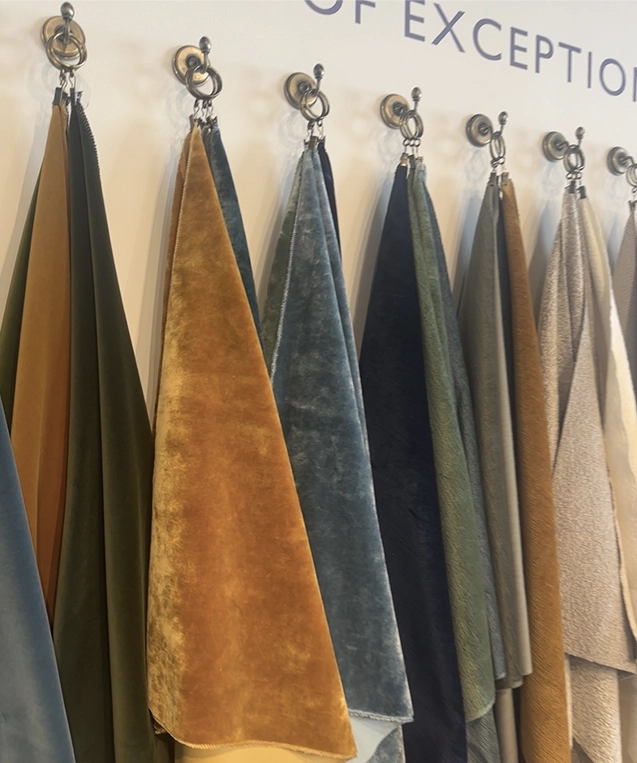
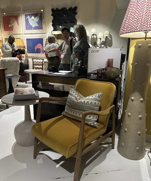
Soft, warm yellow has been building momentum for a couple of seasons, and this time round it’s found its perfect partner in blue. We spotted butter yellow repeatedly across sofas, cushions and bedding, almost always styled alongside blue tones rather than used on its own.
The combination works because the two do opposite jobs: yellow brings warmth and softness to a room, while blue cools it down and adds a more grounding element. The result feels fresh without being jarring, an easy pairing that works just as well in a bedroom as it does in a living space.
Ruffles
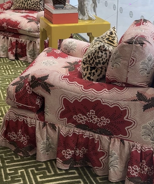
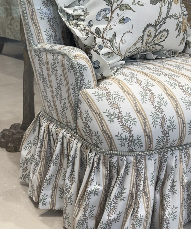
Texture took a softer, more romantic turn this year with ruffles appearing across the showrooms. The detail showed up on bedding, as well as trimming the edges of chairs and sofas, adding movement and a handcrafted feel to otherwise clean silhouettes. As seen in the Turnell and Gigon showroom, it's a trend that brings a sense of ease and femininity into a room, whether used as a single statement piece or layered throughout a scheme.
Archive Pieces
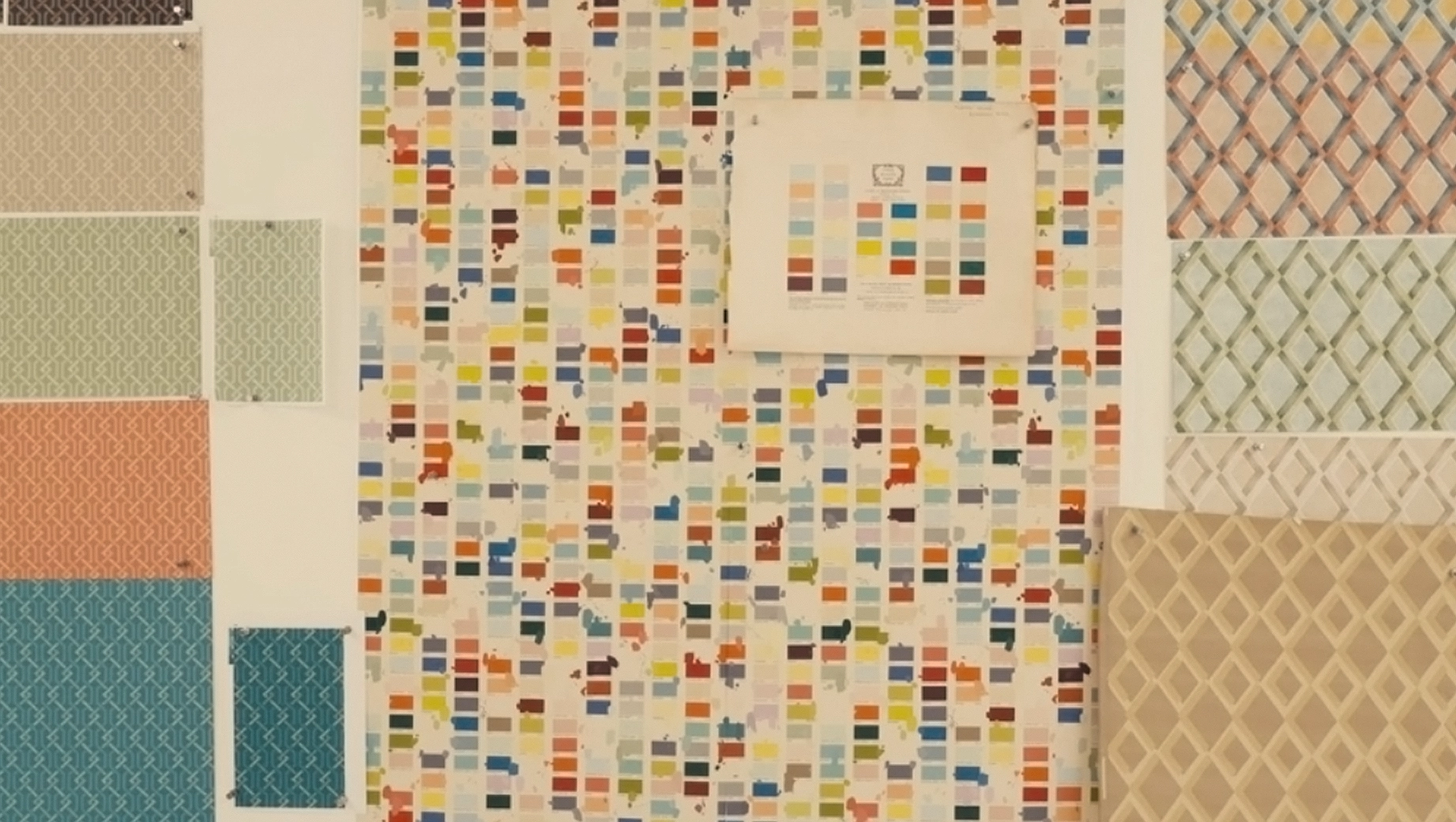
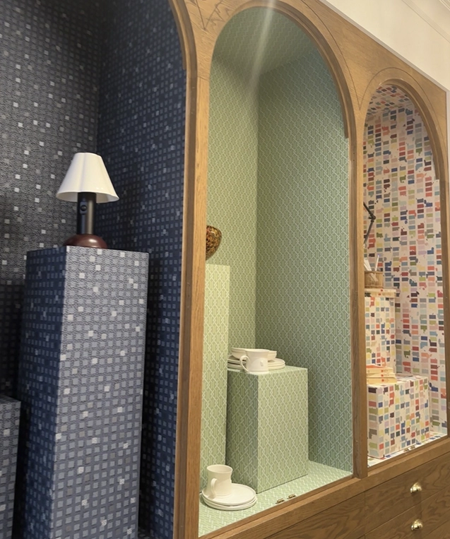
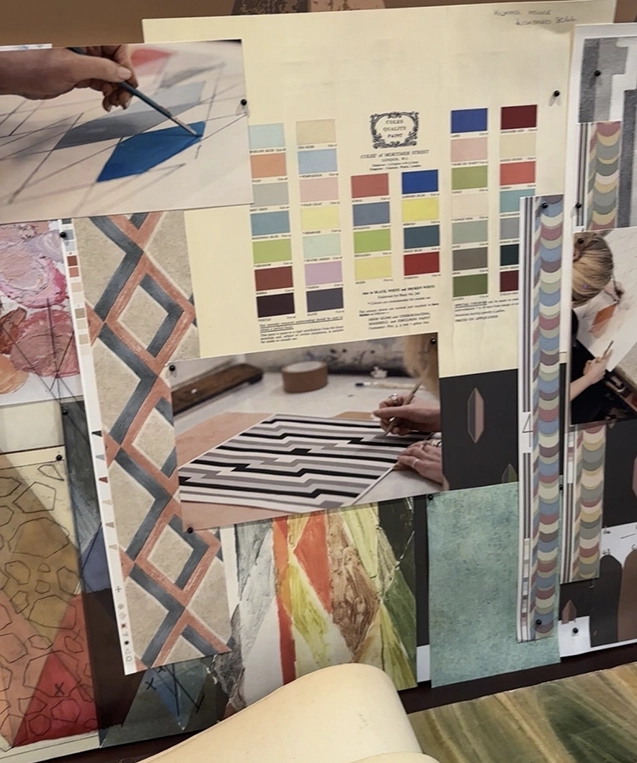
Looking to the past for inspiration remained a strong thread this season, and Cole & Son’s new Formations collection was a standout example.
Drawing on more than 150 years of the brand’s archive, the collection revisits historic motifs, from grids, stripes, diamonds and trellises, and reworks them using both traditional and contemporary print techniques. The result balances precision with a softer, more tactile finish, giving heritage patterns a distinctly current feel.
It’s part of a wider move towards designs that draw on craft and history rather than starting from a blank page, giving interiors a sense of depth and story that feels well suited to how we’re layering and personalising our homes today.
Wrapping Up
This year’s FOCUS/26 showed a season defined by playful print, softened texture and a renewed appreciation for heritage. Leopard, butter yellow and blue, ruffles, and archive-inspired designs may each tell a slightly different story, but together they point towards interiors that feel considered, tactile and, above all, personal.
Like what you see?
Selected Works


Cool Blue is a full-service agency that pays special attention to the interiors sector. We make waves in the home and lifestyle world, whether by helping brands find new relevancy or supercharging their sales, our strategic expertise makes brands like yours achieve their goals.
Contact:
London
Toffee Factory
Lower Steenberg’s Yard
Newcastle upon Tyne
NE1 2DF
MAP
T. 0191 375 9150