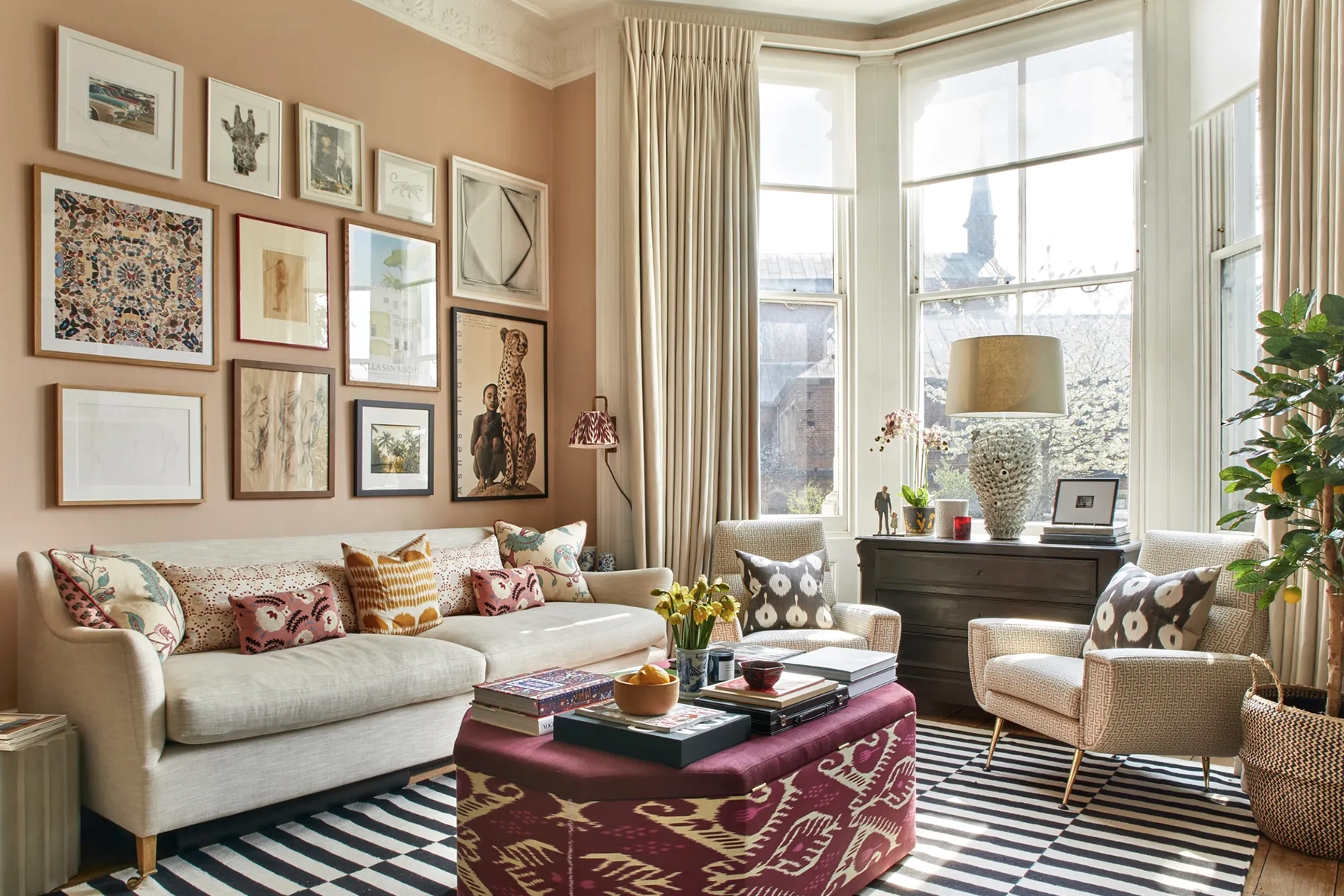
(Image credit: Country Life)
The New Neutrals: Why Beige Is No Longer Enough
For years, beige was the answer to everything. Need a timeless living room? Beige. Selling your house? Beige. Want a neutral backdrop that won't date? Beige. And whilst beige still has its place, the world of interiors has quietly moved on. The most desirable homes today are embracing a richer, warmer palette of colours that offer all the versatility of a neutral but with considerably more personality.
From Farrow & Ball’s Setting Plaster to Little Greene’s Travertine and the earthy clay-inspired shades dominating the collections of COAT and Lick, a new generation of neutrals has arrived, and they may be the colours that define the next decade of interior design.
From Greige to Beige to Peige
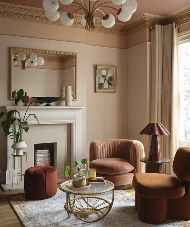
If the 2010s belonged to greige, and the early 2020s saw the return of beige, we’re now entering the era of what we’re calling peige.
Part pink, part beige, peige sits somewhere between a traditional neutral and a colour statement. It’s warmer than beige, softer than terracotta and more sophisticated than blush pink.
Think plaster walls warmed by the afternoon sun. Think natural pigments, clay tones and dusty rose undertones.
The perfect example? Farrow & Ball’s Setting Plaster.
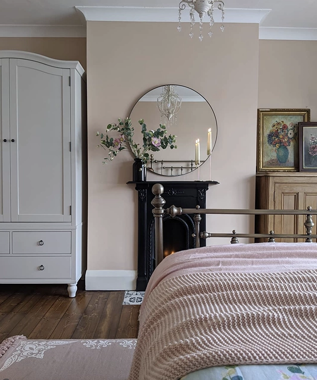
Originally described as a dusty pink, Setting Plaster has become one of the most influential paint colours of recent years. It isn’t obviously pink, yet it brings a warmth and depth that standard beige simply can’t achieve.
It’s beige 2.0.
Why We’re Falling Out of Love With Beige
Homeowners are increasingly looking for spaces that feel warm, cocooning and personal rather than simply neutral. Whilst beige provides a safe backdrop, it can sometimes feel one-dimensional, particularly in modern homes that lack architectural detailing.
The new neutrals solve this problem beautifully as they introduce subtle undertones that create movement and interest throughout the day. Depending on the light, they can appear pink, taupe, stone or clay, helping rooms feel layered and inviting without becoming overwhelming.
The result is a home that feels considered rather than cautious, and we’re seeing this trend play out in our own homes too. Our Associate Director recently took the plunge and painted her open-plan living space in Paint & Paper Library’s Powder IV, a beautifully soft plaster pink that proves these warmer neutrals can work just as well as traditional beige.
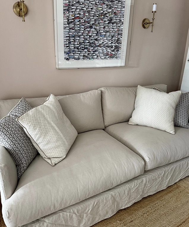
(Image credit: Katie Wilson)
What Paint Brands Are Telling Us
When we look at the colours gaining the most attention across leading paint brands, a clear pattern emerges.
Farrow & Ball’s Setting Plaster continues to be a favourite amongst designers looking to add warmth without committing to a bold colour scheme.
Little Greene has seen growing popularity of shades such as Travertine, Silent White and Middle Buff, all of which sit firmly within the warm neutral family.
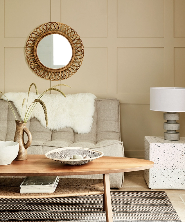
(Image credit: Little Greene, Travertine)
Meanwhile, brands such as COAT and Lick have built entire collections around earthy pinks, soft taupes, mushroom tones and clay-inspired shades that blur the line between colour and neutral.
The message is clear; homeowners still want versatility, but they no longer want bland and boring.
The Rise of Plaster Tones
One of the defining characteristics of the new neutrals is their connection to natural materials.
Plaster-inspired colours have a softness and authenticity that feels particularly relevant today. Influenced by Mediterranean architecture, limewash finishes and natural pigments, they bring a sense of warmth and craftsmanship that works beautifully in both traditional and contemporary homes.
Pair them with oak, linen, natural stone and textured fabrics and the result feels effortlessly sophisticated.
They’re colours that create an atmosphere before a single piece of furniture has been added.
How to Use The New Neutrals
The beauty of peige and plaster-inspired shades is their flexibility.
Use them across walls, woodwork and ceilings for a cocooning effect, or combine them with richer earthy tones to create contrast and depth. They work particularly well alongside warm woods, aged brass, natural textiles and tactile finishes.
The Future of Neutral Interiors
Beige isn’t going anywhere, but its reign as the default neutral may be coming to an end.
Today’s most successful interiors are moving beyond safe, flat colour palettes and embracing shades that bring warmth, depth and personality to a space. Colours that feel natural rather than stark, comforting rather than clinical.
If greige was the neutral of the last decade and beige defined the years that followed, then peige may well be the neutral of the future.
And judging by the popularity of colours like Setting Plaster, that future has already arrived.
Selected Works
Mako BespokeFrom Quiet Craft To a Confident Brand Presence

Haddon Crafting Luxury BathroomsCrafting Luxury Bathrooms

French Bedroom - EventFemale-founded British furniture brand.

Interior Trends for 2025Project type


The Floor RoomCreated to transform the world of flooring

The Floor Room - Social MediaEnhancing the brand’s social media presence

Concept BespokeOffering exceptional design, build and maintenance services for prestigious properties.

Spiral CellarsWine cellars less ordinary.

Barker and Stonehouse: Gateshead Store LaunchUnveiling the new £5m store.

ercol x 2LGReaching millions with a message of pride.

French BedroomA luxury bedroom furniture brand.

Duresta & Matthew WilliamsonFashion forward.

EggerImagine. Create. Egger.

HerdysleepOut-of-the-box brand strategy.

Barker and Stonehouse & Drew PritchardLaunching a furniture first.

ercol: Centenary CampaignA 100 years of craft.

SleepeezeeReawakening a sleeping giant.

Cool Blue is a full-service agency that pays special attention to the interiors sector. We make waves in the home and lifestyle world, whether by helping brands find new relevancy or supercharging their sales, our strategic expertise makes brands like yours achieve their goals.
Toffee Factory
Lower Steenberg’s Yard
Newcastle upon Tyne
NE1 2DF
MAP
T. 0191 375 9150