(Image credit: Claybrook Studio)
Why Chequerboard Tiles Are Everywhere – And What That Says About How interiors Are Being Designed For Visibility
From design-led Instagram feeds to boutique hotel openings, one design detail is appearing everywhere – chequerboard tiles. Whether bold monochrome schemes or softer, tonal interpretations, this graphic and eye-catching pattern has firmly re-established itself as a go-to design feature. As Homes & Gardens stated earlier this year checkerboard tiles are ‘back on trend for 2026’.
Meanwhile, leading tile brands such as Bert & May, Otto Tiles & Design and Ca Pietra all have chequerboard tile collections, demonstrating that this style is in high demand. Yet its resurgence is about much more than just nostalgia or aesthetics. Chequerboard tiling speaks directly to a broader shift in how interiors are being designed with visibility in mind.

(Image credit: Otto Tiles & Design)
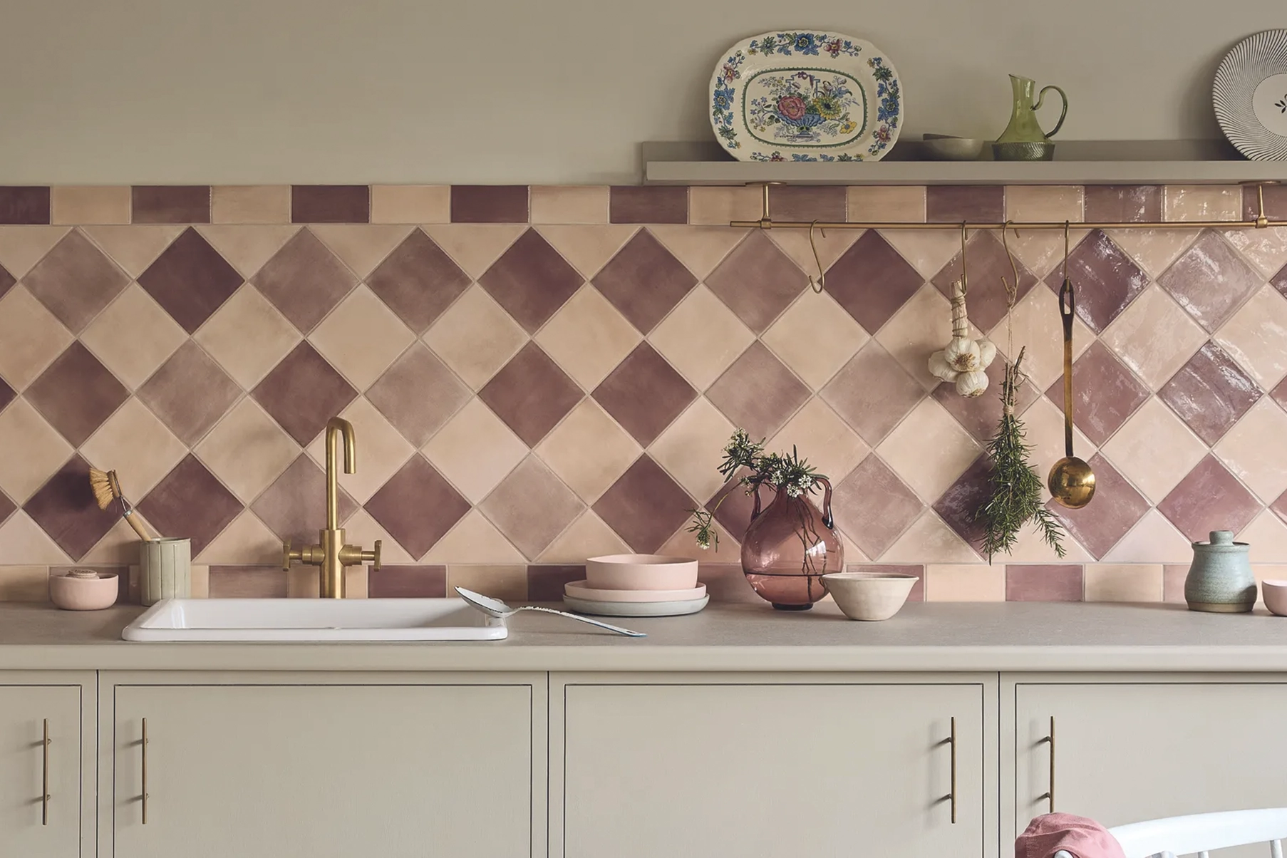
At face value, the appeal is obvious. Chequerboard patterns offer instant visual impact, combining order with expression and rhythm with contrast, along with a comforting dose of nostalgia and familiarity. The striking nature of this pattern means that it is clearly visible in a photograph, even at a glance or on a small screen.
And that’s precisely the point. Interiors today are rarely experienced in isolation. They are documented, shared and consumed digitally, often within seconds. Designers and brands are acutely aware that a space’s success is tied not only to how it feels in person, but also to how effectively it translates visually online. Chequerboard tiles deliver on both fronts – they are nostalgic enough to feel familiar, yet bold enough to stand out in a crowded feed.
This visibility-driven approach is influencing material choices more broadly. Surfaces are being selected for their ability to “read” well on camera – from high-contrast finishes and reflective materials to defined patterns. In this context, chequerboard tiling functions almost as a visual anchor, grounding a space while simultaneously drawing the eye.
Many hospitality spaces have used this to great effect. Jacuzzi Kensington by Big Mamma Group pairs green and white chequered floors with bold red tablecloths for a memorable style statement. Meanwhile, Dorian in Notting Hill features a monochrome chequered floor that delivers a classic, yet equally impactful look. It’s this visibility that makes chequerboard ideal for hospitality environments where first impressions matter and online shareability is a commercial consideration.

(Image credit: Jacuzzi Kensington by Big Mamma Group, photograph taken from Mix Interiors)
There is also a strategic versatility to the pattern. While traditional black-and-white schemes evoke a classic, Victorian sensibility, contemporary interpretations allow for a wide range of brand expressions. Soft neutrals create a more understated, design-led feel, saturated colours introduce playfulness and energy, and irregular or oversized formats bring a sense of modernity. This adaptability makes chequerboard tiling a powerful tool for storytelling, enabling designers to align a space with a specific identity while retaining that all-important visual clarity.

Soft, neutral chequerboard. (Image credit: Bert & May)
Interestingly, the resurgence of chequered tiles also reflects a desire for order and structure in an otherwise fluid design landscape. As interiors increasingly blend functions, from working to dining to socialising, strong visual cues help to define zones and guide movement. A patterned floor can subtly divide areas without the need for physical barriers, offering both practicality and aesthetic cohesion.
For PR agencies and brands, the implications are clear. Photogenic design is no longer a secondary consideration; it is integral to how spaces are conceived, launched and communicated. Elements like chequerboard tiling provide an immediate hook – a recognisable motif that can carry across press imagery, social content and brand storytelling. In an attention economy, these visual signatures are invaluable.
However, the widespread adoption of such a distinctive pattern also raises questions about differentiation. As chequerboard tiles become more ubiquitous, the challenge for designers is to use them in ways that feel imaginative, rather than formulaic. We think that the most successful schemes are those that integrate the pattern into a broader narrative, rather than relying on it as a standalone statement.
Ultimately, the return of chequerboard tiles is not just a trend revival – it reflects a more image-conscious era of design. Interiors are being shaped as much by the camera lens as by the human experience. In this context, patterns that offer clarity, contrast and instant recognition will continue to dominate.
Want your next project to stand out? Get in touch with our team to hear more about how we can help with PR and brand visibility.
Selected Works
Mako BespokeFrom Quiet Craft To a Confident Brand Presence

Haddon Crafting Luxury BathroomsCrafting Luxury Bathrooms

French Bedroom - EventFemale-founded British furniture brand.

Interior Trends for 2025Project type


The Floor RoomCreated to transform the world of flooring

The Floor Room - Social MediaEnhancing the brand’s social media presence

Concept BespokeOffering exceptional design, build and maintenance services for prestigious properties.

Spiral CellarsWine cellars less ordinary.

Barker and Stonehouse: Gateshead Store LaunchUnveiling the new £5m store.

ercol x 2LGReaching millions with a message of pride.

French BedroomA luxury bedroom furniture brand.

Duresta & Matthew WilliamsonFashion forward.

EggerImagine. Create. Egger.

HerdysleepOut-of-the-box brand strategy.

Barker and Stonehouse & Drew PritchardLaunching a furniture first.

ercol: Centenary CampaignA 100 years of craft.

SleepeezeeReawakening a sleeping giant.
Cool Blue is a full-service agency that pays special attention to the interiors sector. We make waves in the home and lifestyle world, whether by helping brands find new relevancy or supercharging their sales, our strategic expertise makes brands like yours achieve their goals.
Toffee Factory
Lower Steenberg’s Yard
Newcastle upon Tyne
NE1 2DF
MAP
T. 0191 375 9150